master plan, extension of hospital campus (120 beds), renovation projects
master plan, extension of hospital campus (120 beds), renovation projects
In 1994, assar architects (formerly Luyten & Lens) was commissioned to build an eye clinic on the Middelares campus in Deurne. At the time, the campus consisted of a recent wing from the 1980s and an old wing from the 1950s. Our intervention was limited in scope, but very successful.
assar was subsequently commissioned to develop the master plan for the entire campus. After this initial step, three successive projects were completed that extended the hospital campus. Between 1997 and 2000, an orthopaedic clinic was built, some of the consultation rooms were renovated and several maternity rooms were given a luxury interior fit-out.
In 2005, Projects 1 and 1b were completed and brought into use. These master plan projects involved a new extension of around 100 beds and an outpatient clinic (Project 1) and a new extension for the emergency department, the lab and apartments for the use of doctors on call (Project 1bis). Project 9 has also been completed, consisting of the renovation of part of the existing wings. Project 12 is currently coming to an end, almost all parts of it having been implemented.
| program | master plan, extension of hospital campus (120 beds) • renovation projects |
| client | AZ Monica NPO |
| address | Florent Pauwelslei 1 • 2100 Deurne |
| building type | heal |
| status | under construction |
| expertises | |
| offices | antwerp |
| size | 11.500 m² |
| team | • client: AZ Monica NPO • technical engineering: Botec |
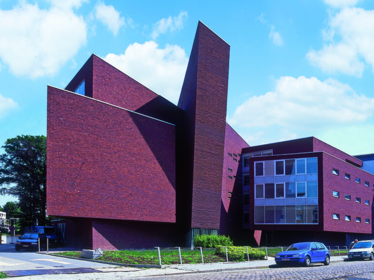
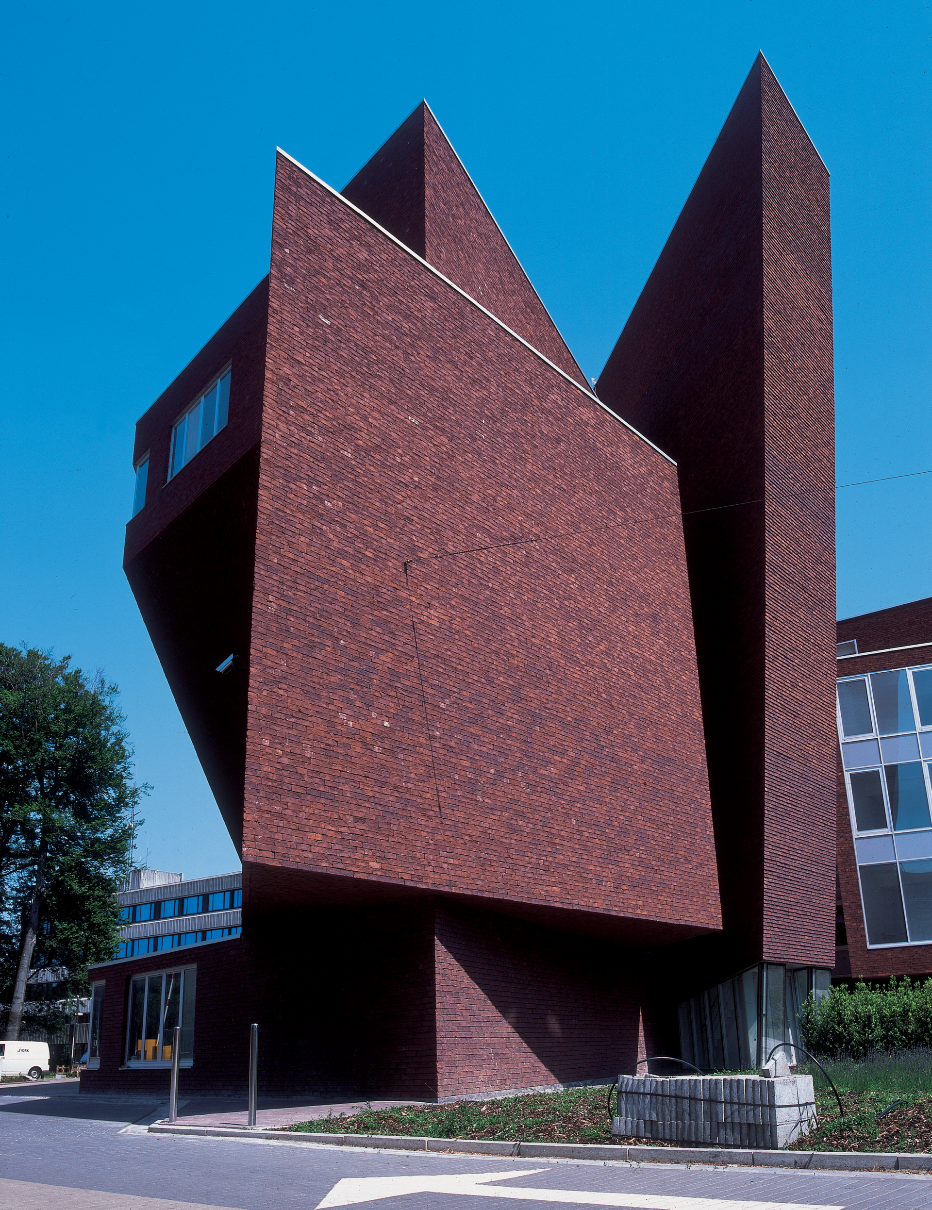
The campus covers a small area and is located on a junction between two streets. The extension had to be undertaken on Herentalsebaan, an ugly and noisy approach road. We decided to place the closed volumes along this road and to orient the patients’ rooms towards the vegetation and the courtyard. The underground car park’s connection with the street is now safe, as the volumes are set back slightly. There is room for a green front garden into the bargain: this creates the necessary distance from the street, but also brings a breath of fresh air to the streetscape. The surprisingly sculpture-like brick façade punctures the ordinariness of the streetscape. The building’s elegant restraint on the street side contrasts with the remarkably light patio at the epicentre of the hospital. All foot traffic tends to pass through this patio. This is where the lifts emerge from the car park, and where the reception desk and the restaurant are located.
From here, the hospital is legible and clearly structured.
This legibility is supported by the integrated artwork created around and with the signage. The patio is covered by a glass dome with a steel roof truss: even in rainy weather, this spot is central to movements through the various buildings.
To draw attention to its acute and ambulatory platform, the dynamic management proposed an ambitious programme for the limited available floor space.
Great care also needed to be taken – in a no-nonsense way – over the amenity value of the buildings and environment. The client opted for entities that function with relative autonomy, each with its own atmosphere. This had already been achieved in previous years in a number of smaller projects prior to VIPA funding being obtained, and was carried through into the master plan, which created a framework with logical circulation patterns for the entire hospital and the necessary flexibility for changes and extensions.
Project 1 saw the completion of some major work. For instance, a new wing with two underground floors was developed, used for parking, storage, changing rooms and service spaces.
On the ground floor, a central hall was created with a dome and the outpatient clinic. Above this were four nursing wards, including a maternity unit with delivery area. We also built a small 5th floor with service space and room for building systems such as air conditioning units and collectors.
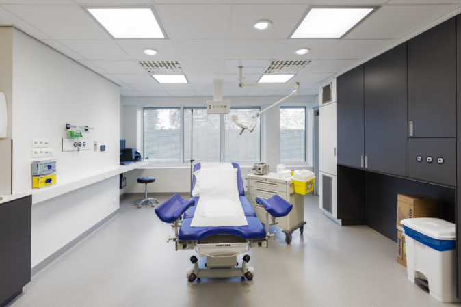
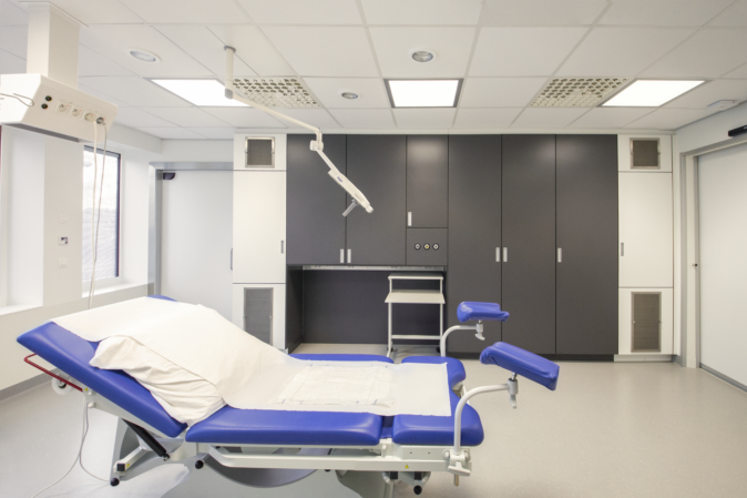
Project 1b consisted of a newly constructed part adjoining Wing A of the hospital and an internally renovated part. An extension of the emergency department with an ambulance entrance and general entrance was built on the ground floor. The emergency department was also renovated. A new lab was constructed on the first floor, two rooms were added to the operating theatre, and the recovery area was renovated and extended. On the second floor there was a service space for air conditioning units and collectors and four apartments for doctors on call.
Some crucial technical installations were introduced or integrated into the hospital’s existing systems. For example, a bank of lifts was created with separate lifts for goods and visitors. For the sanitary facilities, there is rainwater recovery and measures to combat legionella bacteria. There are delivery baths for the maternity ward. There is local underfloor heating, balanced ventilation with heat recovery, smoke and heat extraction, general and fire safety measures, medical gas delivery systems, hospital automation technology, a nurse calling system, facilities for data, telephony, TV and music, an emergency generator for power cuts and installations for specific medical devices.
Technical installations were also introduced and integrated into the hospital’s existing systems in Project 1b.
In addition to the systems listed above, two new operating rooms were equipped with laminar flow. Both projects demonstrate the capacity to design a highly sophisticated technical installation and integrate it into the existing facilities of an extremely complex building.
Project 9 involved the renovation of various departments in the hospital’s existing buildings.
Specifically, a nuclear imaging department was created. In addition, a 30-bed nursing ward was completely renovated on A+3. In Wing B+3, the existing nursing ward was renovated. On C+2, two rooms for cardiac catheterisation were built with the associated ancillary areas. An oncology day centre with reception, examination and meeting rooms was created on C+3, while a whole new area for administration and management was set up on C+5. Finally, the sterilisation station on A+1 was extended and renovated.
As in the previous conversion work, building services and technical installations were integrated.
The project demonstrates the capacity to redesign and renovate existing buildings, taking account of existing structural elements that must be kept and of the technical facilities and maintaining and improving the existing circulation patterns on the campus. The applicable fire safety requirements have also been considered, with the necessary adjustments being made. The entire hospital had to remain fully operational during the work – a complicating factor in both design and implementation, requiring meticulous timing and planning.
The following crucial technical installations were introduced and/or integrated into the hospital’s existing technical systems:
• lifts: 2 new lifts installed in existing lift shafts
• sanitary facilities: plumbing for hot & cold water
• heating: radiator heating, warm air heating
• ventilation: balanced ventilation with heat recovery, cooling (fans, etc.), 2 new ORs equipped with laminar flow
• fire station: link to fire station
• building management system
• medical gases: installation of medical gases, oxygen distribution network, nitrogen distribution network, compressed air distribution network
• hospital automation (entire hospital equipped with an automation system)
• facilities for nuclear imaging device
• facilities for cath lab equipment (UPS, etc.)
• lead walls in cath labs & nuclear medicine
Project 9 has been followed by Project 12, which has again required a whole series of renovations to certain departments and hospital services. During the work, all departments and services have remained in use and strict adherence to timing has been required as the sub-projects followed each other in close succession. For example, one department could only be relocated once another department was ready.
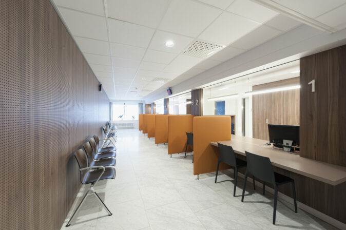
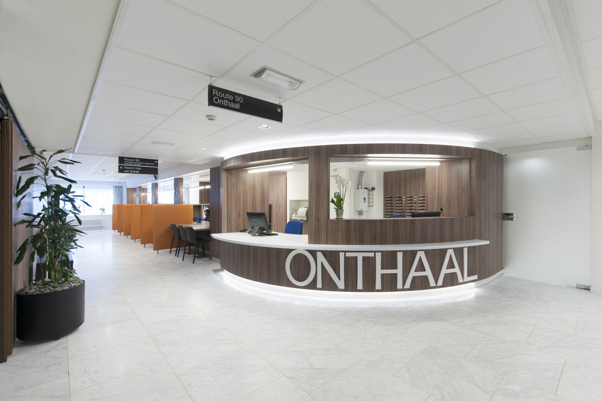
The interior design has been developed to be inviting to visitors/ patients. During the renovation of the entrance hall, a marble floor was therefore chosen to impart elegance and an open feel to the space. Strip lighting in the ceiling indicates routes for people as they walk through and guides visitors to the desk.
The new entrance desk is oriented in such a way that patients immediately see it, whether they enter via the lift area (from the underground car park) or via the general entrance lobby. With its inviting shape and colour, it is the entrance hall’s most eyecatching feature. It has a wheelchair-accessible zone and can be closed with roller blinds. To create an attractive contrast with the white marble floor, the cabinets are made of imitation walnut. The dividing walls at the individual counters, which are there to ensure privacy for patients, are covered with synthetic leather in orange, the department’s accent colour.
For the film on the glass walls, we took inspiration from the AZ Monica logo, creating a more abstract version that has become the basis for all glass manifestation film in the hospital and will now be used everywhere. Comfortable seating has been chosen in the waiting area, with the recurring orange accent in places, and here too, walnut appears in the furniture bases.
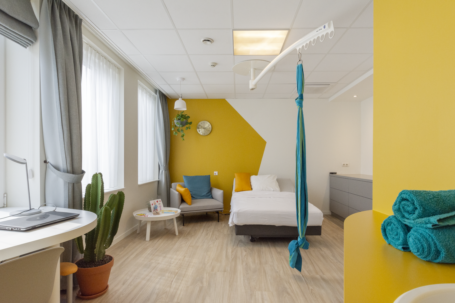
Just like in the delivery area, a hotel atmosphere has been integrated into the interior design using colour and materials.
There are several luxury rooms in the department that are a lot more spacious, but in terms of decor every room is deluxe! The dark taupe walls and floor in combination with the veneer wood cabinets and windowsills create a high-class hotel feel. This extends to the bathrooms. The baby corner has slimline glass walls up to the ceiling that maintain the open feeling in the room. The colour accents on the walls, in the department’s colour, are the work of an artist and are also used in each department’s signage. This is particularly apparent in the lift lobbies.
The sense of calm and light has also been continued in the neonatology department, ensuring a peaceful atmosphere for parents and newborns.
There are 5 delivery rooms in this department: 2 with a birthing pool, 2 with a relaxation bath and 1 with a large shower room. All rooms point towards either the outer wall or the patio, to bring in natural light everywhere. The interior design here was inspired by a luxury hotel room.
This is achieved with tasteful wallpaper behind the bed and a decorative bed wall panel, without losing sight of maintenance requirements. RGB light panels impart a certain depth to the room by constantly changing colour. The corridor consists of several alcoves, with a different accent colour for each room door. The ceiling near these alcoves is covered with plasterboard in which a large lightbox is set, accentuating the alcoves even more. The alcoves’ colours and symbols are inspired by the department’s logo, which is also displayed at the reception desk. The corridor walls feature the same attractive wallpaper. The imitation walnut of the desk furniture forms a beautiful, harmonious whole with the rest of the space.
In this vital department where, healthy stimuli are a part of care, the interior design has been developed as follows;
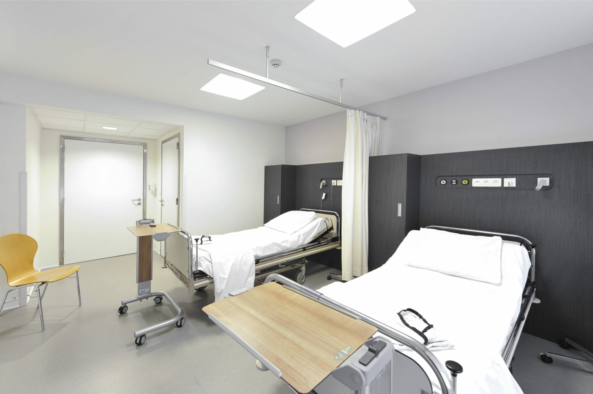
A homely atmosphere has been created in the patient compartments using imitation light oak in the cupboards (under the basin and the patient cupboard) and in the wall panelling. The compartments are deliberately oriented to the outer walls for the sake of natural light. To maximise patient comfort, storage space was needed for pillows and other items. This has been provided under the extra-deep windowsill. The working group has opted for integrated deep drawers – an ergonomic choice to ensure a tidy workspace inside the compartments.
An administrative zone has been designed for the nursing teams in each compartment: a work surface at writing height with a lockable medical cabinet underneath. The designer was looking for an idea to reconcile patient privacy with the client’s need to keep costs down and came up with a degradé window film applied to the glass compartment walls in the accent colour of the compartment itself.
This film provides sufficient visibility at eye level but ensures privacy for the patient in bed and a pleasant atmosphere in the corridor. All nursing functions, such as the reception desk, dirty and clean storage, staff kitchen and medication room and the doctors’ offices, are centrally located in the middle block, minimising the distance to be covered for interventions. There is a waiting and discussion room behind each department door.
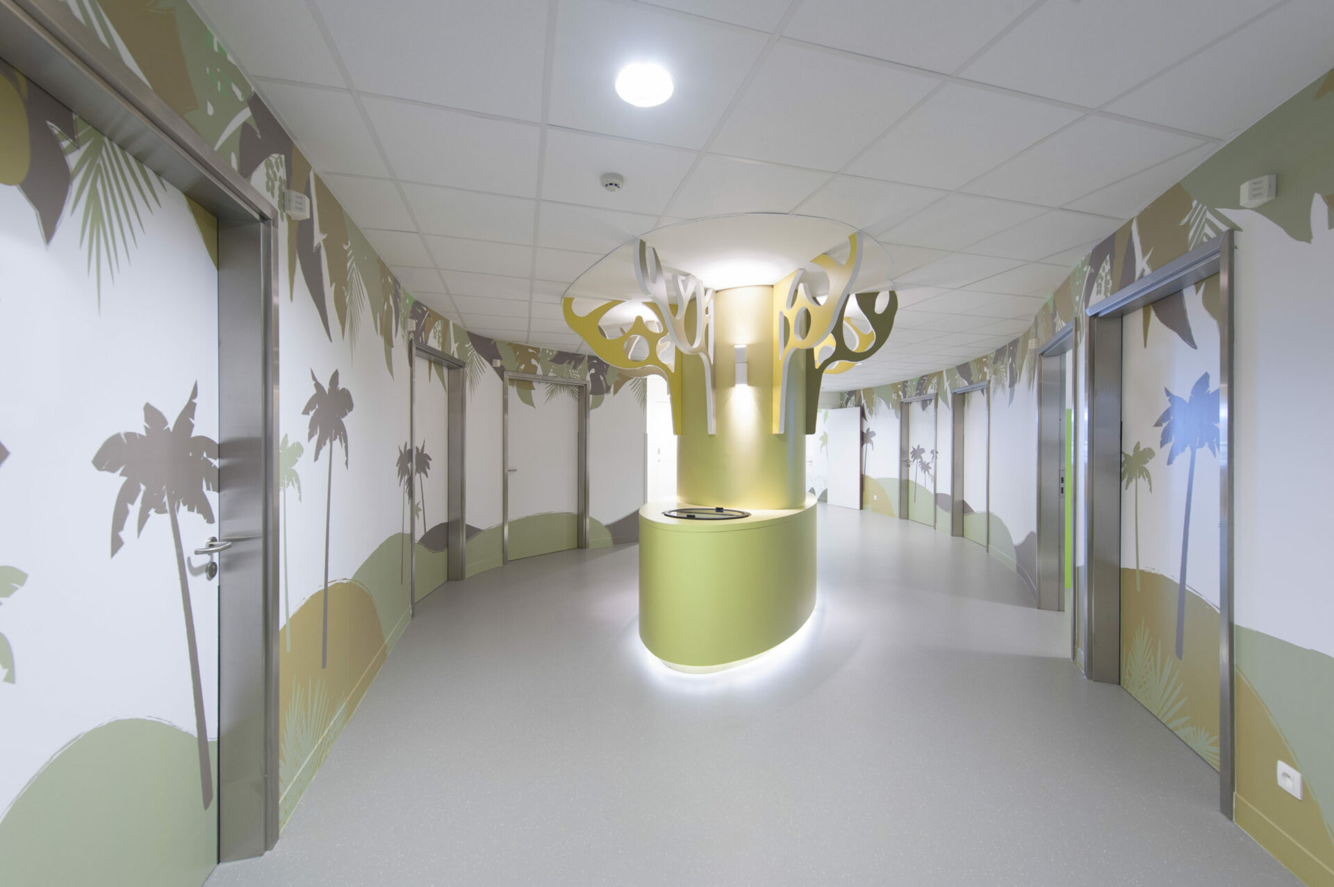
A child-friendly interior design has of course been chosen here, and this had to appeal to all ages (0 to 16 years). The working group has opted for a zoo theme, and the atmosphere is mainly created by means of films applied to the walls in the rooms and corridors. To make the corridor child-friendly, we have affixed large animal silhouettes in strong colours against the curved protruding walls there. Each animal decorates the entrance door of a room, and the accent colour is then picked up in the eating tray, parents’ relaxation corner and sanitary facilities. A deep windowsill makes a good place to sit or play. Neutral walls with a few colour accents make the rooms spacious and pleasant.
Child-friendly materials have also been used for the movable furniture to create an obstacle-free environment. A world map has been placed in relief on the side of the bed, on which all the animals depicted in the corridor appear. Research has shown that this provides a distraction for both parent and child. No expense has been spared on the floor either: footprints of the relevant animal are pressed into the rubber from the corridor to the room entrance area, as a route indicator.
The zoo theme is continued in the signage, consultation and waiting area, classroom, and reception.
The entire theme has been developed in close collaboration between the interior architect and the nursing staff. Child and parents arrive in the morning at a ward door marked “welcome”. As this is a closed ward, adults can only enter by means of a door code. On entering, the patient is welcomed by the nursing staff at the semi-circular reception desk, which is wheelchairaccessible and centrally located. Its shape reflects the need to avoid sharp corners and keep the desk as open as possible for supervision purposes. Each child is assigned a room but can first enjoy the seating area which has plenty of fun things to play with, watch and read. The seating area is screened from the passage by a curved play wall. After a visit to the operating room, everyone gets an ice cream from the ‘tree’.
A jungle theme has been chosen by the working group and is created using films on the walls and desk and a central tree in the corridor.
Each sleek white room has been given an accent colour – a touch of colour on the bed wall panel (shock-resistant panel with integrated sockets, medical gases, and indirect lighting), dressing cabinet and coat rack. The coat rack is shaped like a tree, with hooks and a paper clip for the patient’s documents on the branches.
The theme is also picked up in the signage, which plays an important role in a hospital. Both the leaf-shaped room numbering (in the same accent colour as the room) and the wall films with waymarking and pictograms have been given a child-friendly design that fits with the jungle theme. The implementation plan had to be modified when an unexpected column was discovered during the demolition work. The column could not be demolished, so it was decorated in an attractive manner instead: the designer decided to install a central tree there with a built-in freezer and wash basin – an obligatory hygiene facility in every hospital corridor. This tree is now the ward’s most eye-catching feature.
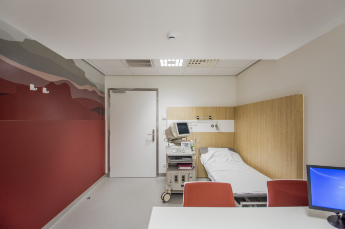
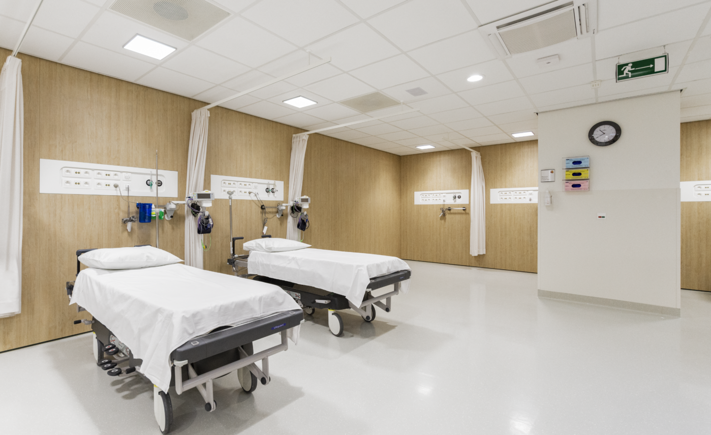
In this ward, where patients only spend a few hours rather than staying overnight, a sober look has been opted for. The accent has been placed on the back wall behind the bed, whose subtly grained dark imitation wood, in combination with a sleek floor and neutral walls, gives the room a modern touch. Technical systems and a storage cabinet with safe are neatly integrated into this wall.
With its colour, the reception desk is quickly spotted in the otherwise white corridor. In the waiting areas, by contrast, the floor covering gives a homely touch. Here too, the patterned film recurs on the glass walls of the waiting areas.
Domesticity was a key word in the design here. The walls are neutral in colour, allowing seasonal decorations to be added. The PVC wood imitation floor and some fresh green accents in the furniture add further visual interest to the space. The dialysis stations are deliberately arranged so as to provide a good overview of the room from the desk, allowing action to be taken promptly in the event of problems. The technical systems have been invisibly incorporated into a low cupboard wall, wellpositioned for maintenance and easy access. This cupboard wall is nicely integrated into the wall or windowsill, which continues in the same colour. A neutral atmosphere with the occasional green accent creates the tranquillity that is so important to patients. All other functions are kept in the background as far as possible.
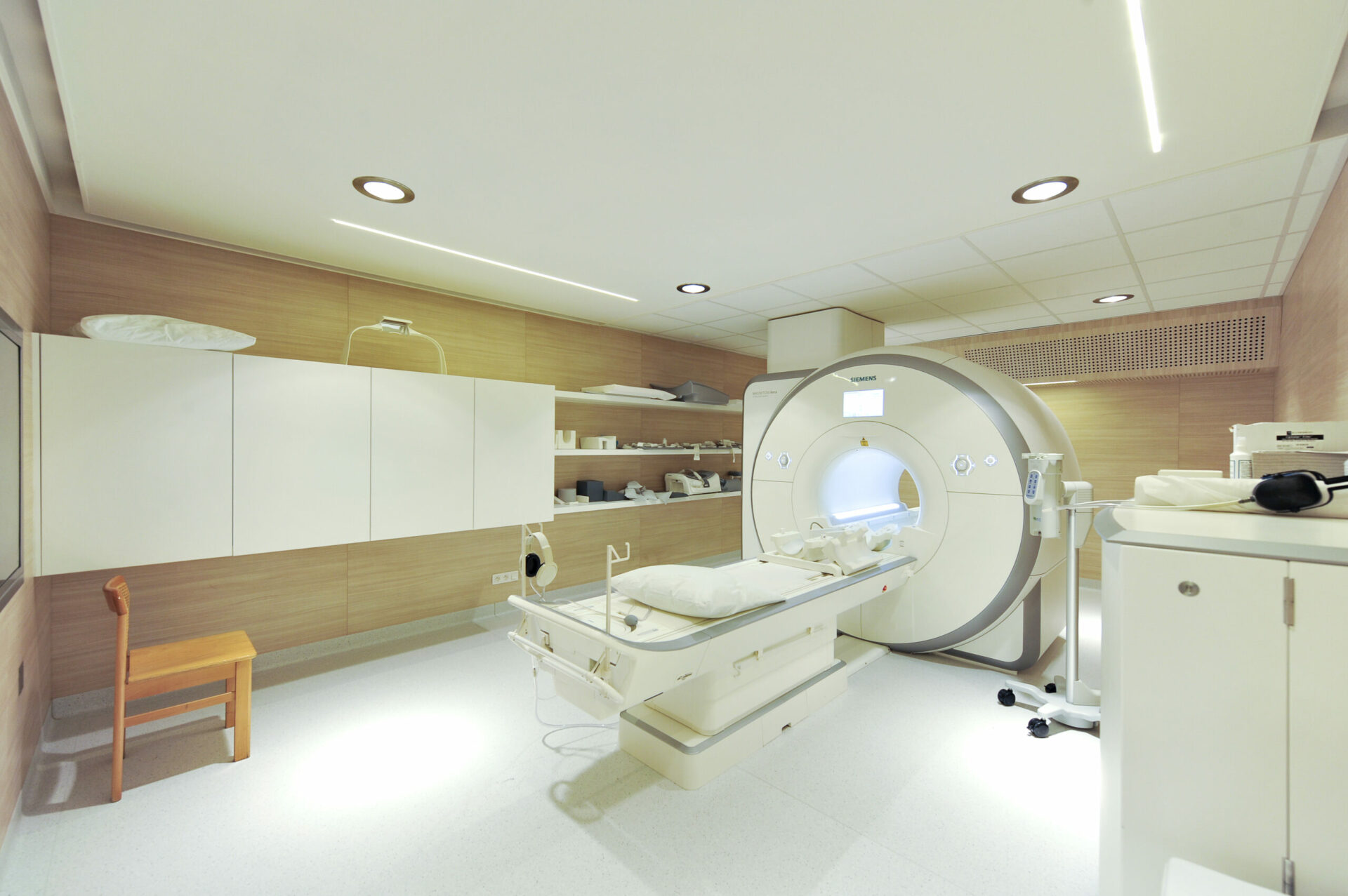
Together with the working group, the NMR department has opted for a trendy look. Two accent colours are used in combination with a light wood type. The NMR scanner, walls and movable furniture all reflect the same choice. To make the patient’s time in the scanner more pleasant, the technical systems and lighting have been integrated into the walls and ceiling as much as possible. The indirect and warm lighting and the light wood wall covering create a warm, homely atmosphere and put patients at ease.
The waiting area for hospitalised patients is also carefully designed. The technical systems are integrated into the wooden walls behind the bed, shielded by a screen with leaf motifs, creating a strong sense of openness.
In the waiting area, long waiting times are made pleasant by comfortable furniture and a view of the courtyard. The central block with its changing rooms and sanitary facilities catches the eye with its air bubble wallpaper and its appearance of floating in space. The glass ball pendants give the room a finishing touch without excessive weightiness.
The interior design here needed to radiate serenity. This desired sense of peace is created by warm wall lighting with a golden core and the use of stylish wallpaper. As the farewell room is adjacent to the cold store, we have opted to camouflage the door with a film that continues onto the wall. The film shows an image of a dandelion losing its seeds to symbolise parting. The waiting area radiates tranquillity without being oppressive.
There are 4 endoscopy rooms: 2 of approx. 20m² and 2 of approx. 30m². These are equipped with an entrance area with toilet, a ‘dirty corridor’ at the rear and a central sterilisation station that is accessible to all 4 rooms.
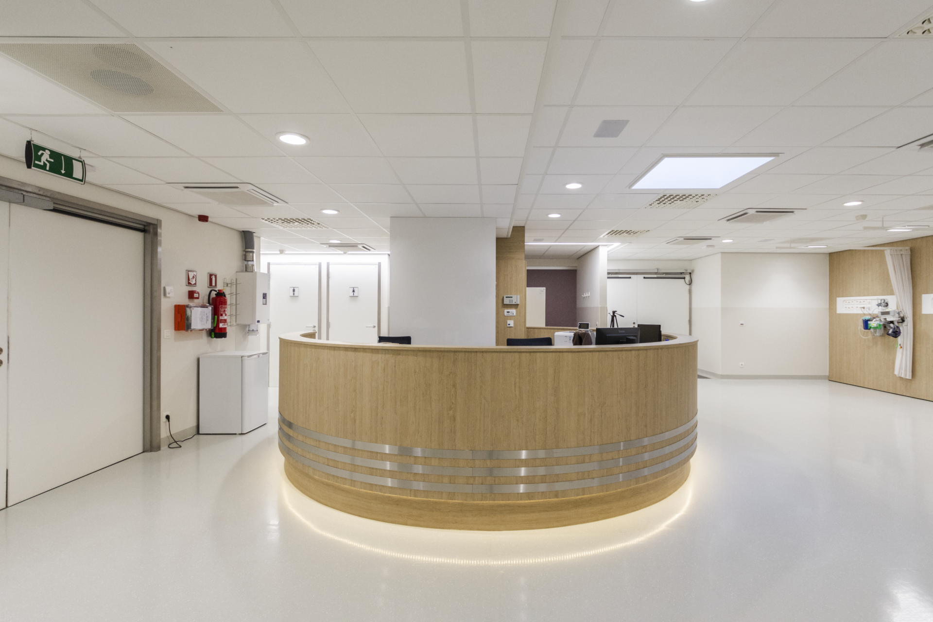
An internal corridor at the front of the rooms is provided for the transport of sterile scopes in non-closed containers due to the high cost of these containers. The central sterilisation unit is divided into a washing and drying zone with a central passthrough box and a passageway. Access to the rooms and recovery area, in accordance with JCI requirements, maintains strict separation of traffic between outpatients and inpatients. In this set-up, the outpatients are taken to the room after an examination by the specialist nurse and the inpatients are first taken to the waiting area. This waiting area is physically separated from the recovery area for outpatients. The counter/ nursing station has deliberately been centrally positioned for supervision, which can be carried out by a small team.
From the existing main route through the campus, the lab reception area is reached on the 3rd floor. Patients are given the choice of obtaining information at the information desk or taking a seat in the waiting room. In line with the healing environment vision, patients are given a warm welcome with a large panoramic nature photo and soft colour tones.
The waiting area forms one open whole with the entrance area, so that it is clear at a glance where you can report your presence and unnecessary signage is avoided. The waiting area has sanitary facilities and also leads to two test rooms. Natural light passes through the test rooms and into the waiting room via the opaque glass doors. The presence of the nursing staff is apparent from their silhouettes, but privacy is duly preserved. Among other things, the test rooms have an anti-static floor covering, in order to comply with the medical S2 classification.
The central positioning of the reception desk means that patients can be spoken to immediately. Samples can be handed in after-hours via the hatch in the desk unit, which is linked to the central telephony system and camera. Authorised personnel have quick access to the lab through badge detection and automated doors. Behind the scenes, away from the patient zone, the floor plan has been based entirely on a consistent and fluid working method, with the help of input from the client and hospital staff. The blood bank is located behind the reception desk. A custom-made piece of furniture provides direct access to refrigerated/non-refrigerated construction kits and a computer with central access to the database; in the immediate vicinity are two pneumatic dispatch stations, one of which is directly connected to emergency and intensive care (emergency line). µ
The lab is further divided into 4 large zones: central lab, bacteriological testing, archive, and administration. The central lab is directly connected to the reception desk for the sake of direct communication with the staff. The space has several workstations and pieces of equipment (Cobas, Advia, Vidas, centrifuge, allergy tester, etc.), all with the necessary data and power connections without getting in the way of staff or compromising hygiene. The bacteriological laboratory is accessible through hermetic sliding doors operated by touchless sensors. The hermetic entrance area contains a changing room, handwashing station, cold unit, and eye douche. The lab itself has equipment such as LAF cabinets and kilns and is positioned to ensure that there are enough workstations, sufficient natural light, and optimal functioning. The archive is a space-saving rolling unit, which almost doubles the storage capacity. The wheeled archive boxes can be moved very easily either individually or in groups, so that an aisle can be created where necessary. The administrative zone consists of two closed offices and a spacious open workplace, with the necessary storage space integrated into the fixed furniture.
At the back of the department is a service room, where all technical systems are accessible. In addition to the usual central heating collectors, ventilation and data rack, this room contains the controls for the LAF cabinets, chilled water cassettes, emergency power supply and so on. The technical systems are all operated via a central Crestron home automation panel.
want to know more about assar or contribute to its continuous development