new extension (32 rooms & 5 service flats), conversion work on the residential care centre (57 rooms) & renovation of grand café, entrance & offices.
new extension (32 rooms & 5 service flats), conversion work on the residential care centre (57 rooms) & renovation of grand café, entrance & offices.
The Sint Jozef residential care centre in Lier is an urban care campus: a cosy home offering quality care where the residents’ well-being is central.
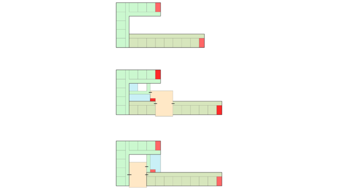
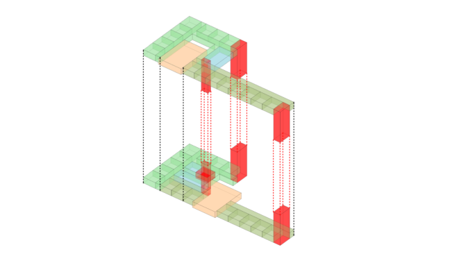
The new extension is designed for 32 residents with cognitive disabilities and based on a vision of normal small-scale living. The extension consists of two 16-person residential units spread over two floors. The unit on each floor consists of two houses with eight residents each. Between these two houses is a large communal area with a separable sitting area, a kitchen and a dining area. There are five assisted living apartments on the second floor.
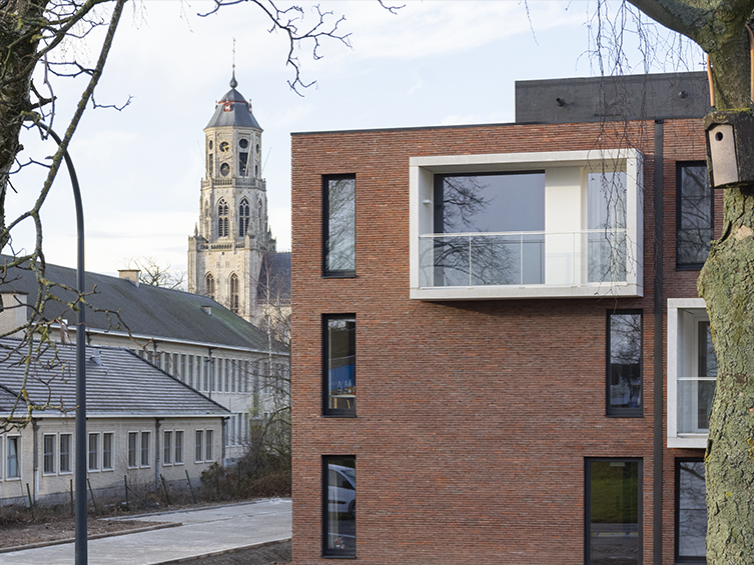
A patio has been integrated into the compact building. It provides light and visibility, as well as giving the residents a sense of orientation and creating a visual link between the two levels.
| program | new extension (32 rooms & 5 service flats), conversion work on the residential care centre (57 rooms) & renovation of grand café, entrance & offices |
| client | De Medemens’ |
| address | Koningin Astridlaan 4 • 2500 Lier, Belgium |
| building type | care • live |
| status | completed |
| expertises | |
| offices | antwerp |
| size | 5.200 m² |
| team | • client: Amate VZW • contractor: Alibo • structural engineering: Fraeye & Partners • technical engineering: Botec • safety coordination: Bovex • EPB: Vicave |
The building has been designed for normal small-scale living. The extension consists of two residential units. Each 16-person unit is situated on one level and consists of two “houses” with eight residents each. Between the two houses is a large communal area, which can be divided up according to requirements, making it possible to create various enclosed or open seating areas, a kitchen and a dining area. Special attention has also been paid to the link between the two levels, both physically with stairs and lifts and visually by providing an open space/patio.
The building has been designed to be as compact as possible. A patio has been incorporated into the structure in view of its depth, providing light and visibility, giving the residents a sense of orientation and creating a visual link between the two levels.
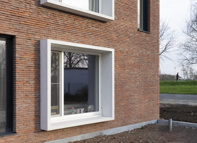
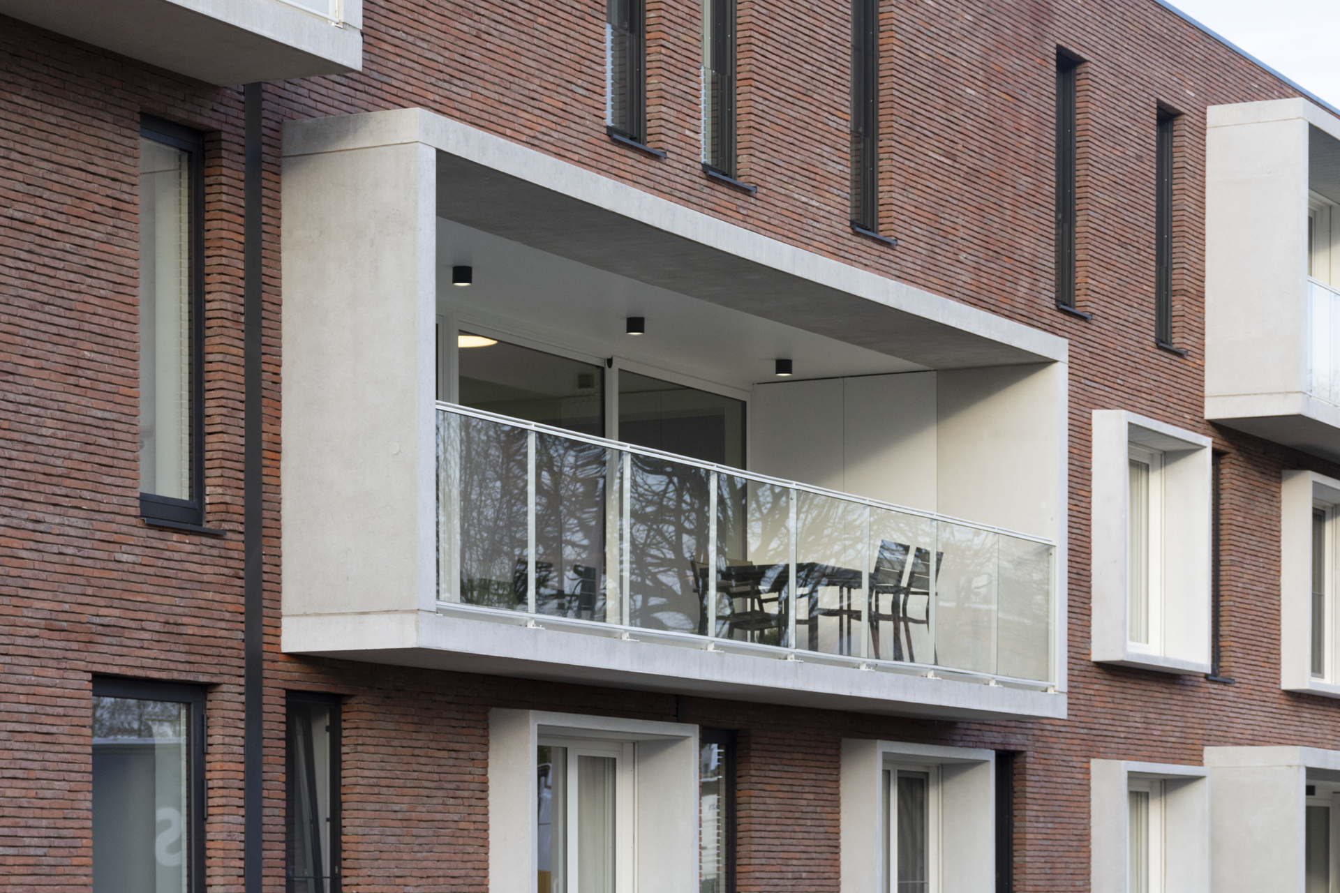
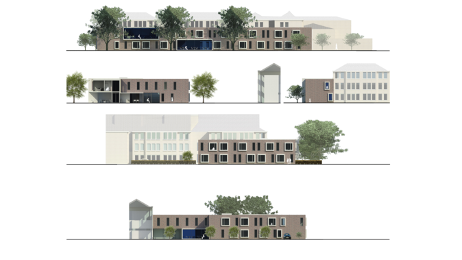
For the façade finish, a red-tinted brick has been chosen, blending perfectly into the urban setting. This facing brick is interrupted by projecting concrete elements that frame the windows and create terraces. The use of exposed concrete is also picked up in the patio. Available flat roofs are designed as green roofs.
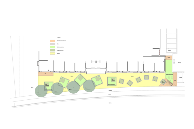
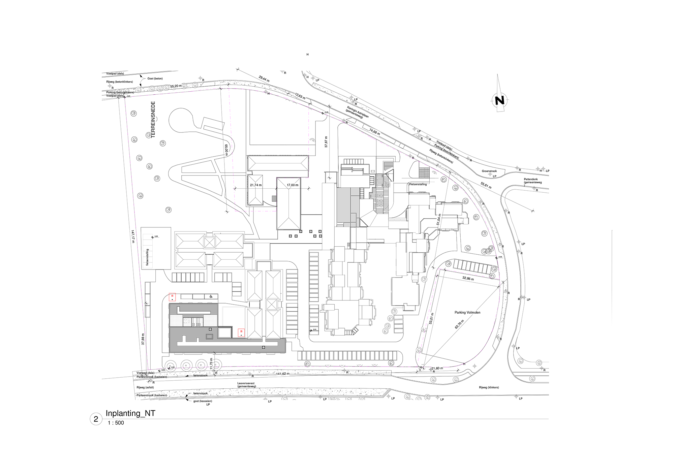
We have sought to integrate the building into its surroundings as naturally as possible.
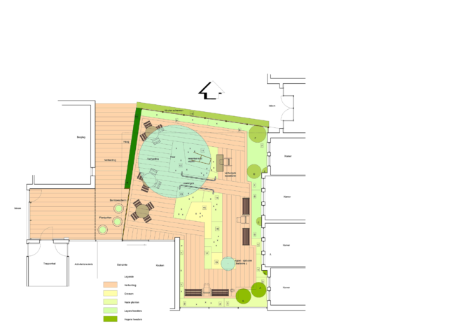
The design consists of two separate parts: the front garden and the enclosed courtyard for elderly people with dementia. The front garden is narrow. It mainly consists of lawn and a few trees – a deliberate choice, as the building with its protruding window cantilevers already makes a striking three-dimensional impact. However, a solution needed to be found to give the garden more amenity value and privacy for the residents. Two elements from the façade have therefore been incorporated in the design; however, this has been done without the garden and building becoming reflections of each other, as a more dynamic character is required in this small space.
The elements picked up on from the building are the widths of the protruding window cantilevers. These are used as the basis for square frames in the ground plan, edged with white concrete like the windows, and planted. The dynamism arises firstly because each of these frames is oriented differently, and secondly because the small frames extend this movement into the narrowest part of the garden. However, the layout also has a deeper significance. The fixed shape of the frames stands for the stable environment in which care is provided and the consistently high level of quality that is maintained, while the movement symbolises the ongoing quest for new forms of care and the dynamism in the care sector – the refusal to confine oneself to familiar approaches.
The courtyard occupies only a small area but provides an interesting illustration of the level of detail of our design vision. The idea is to appeal to all the senses in this small space to stimulate the residents.
Other elements have also been included in the garden. Its usefulness and experiential value are increased by an object that evokes memories, a potting table, seating, a handrail structure for physiotherapeutic exercises and the use of specific plants that attract wildlife (such as buddleia).
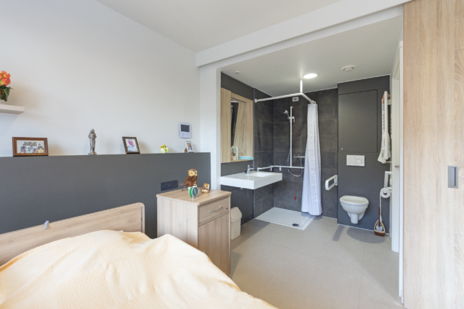
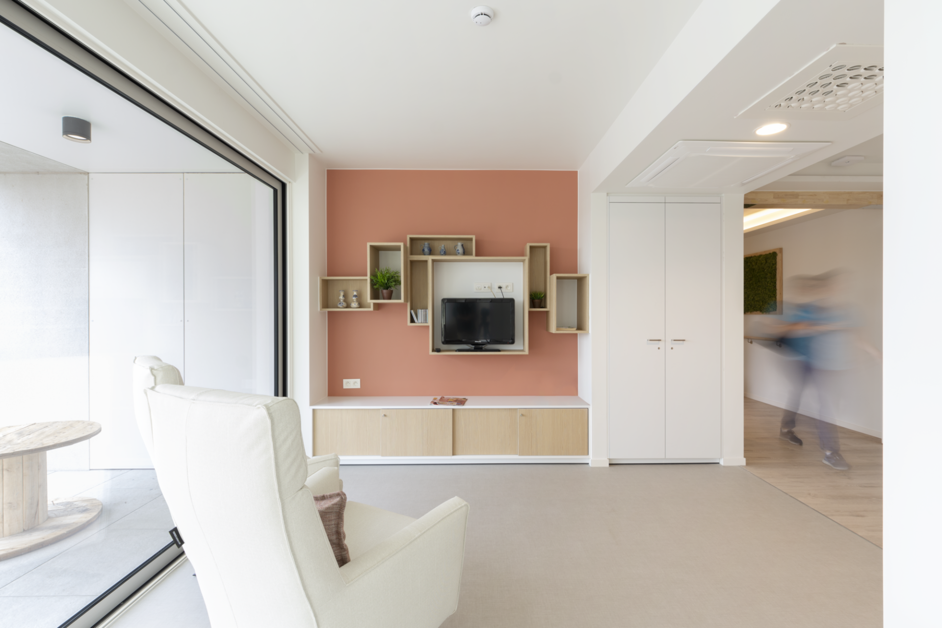
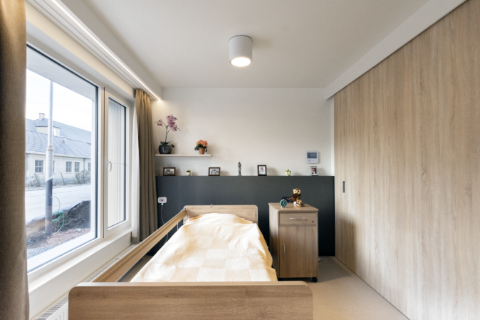
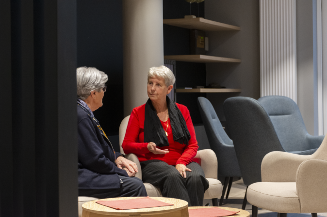
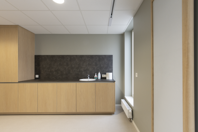
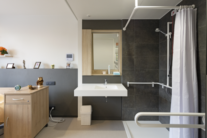
In view of the residents’ specific profile, it was important to design a building that was homely, navigable and accessible to wheelchairs. This is reflected in both the design and the finish. Considerable attention is paid to light and sight lines, as well as to having soft finishing materials that will create a warm feel, such as wooden floors and decorative wallpaper. The same mood is continued in the bathroom using large wall and floor tiles. A built-in fixed mirror cabinet will be installed here that meets the requirements for wheelchair accessibility.
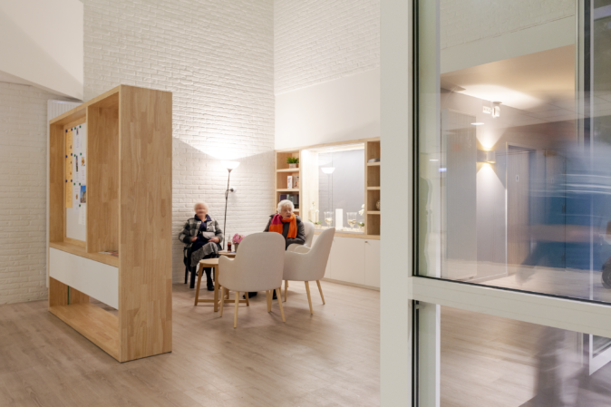
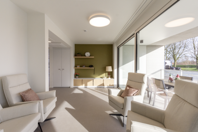
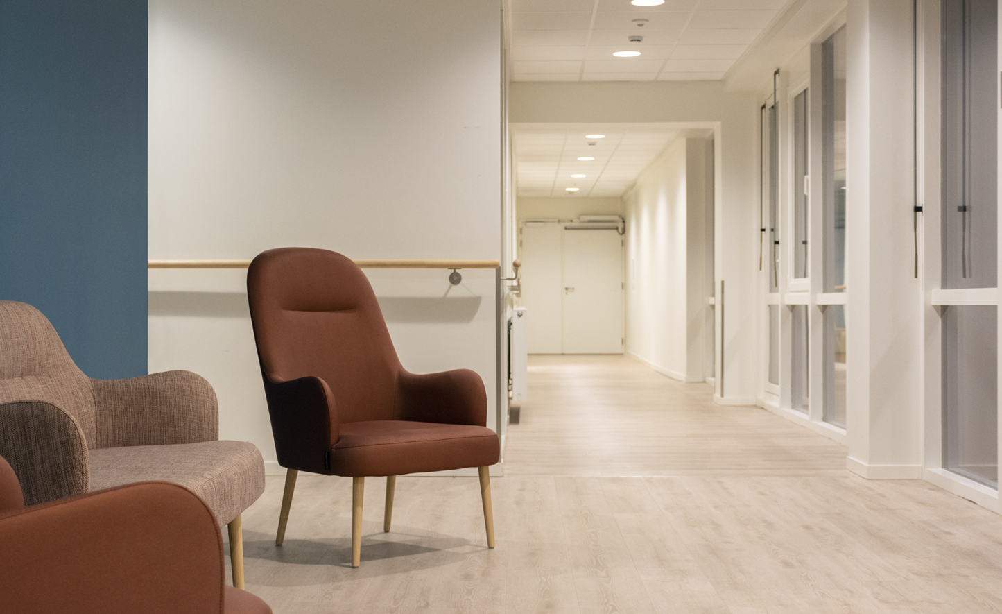
The building is made on a human scale with small seating areas and small residential units, thus avoiding an institutional feel. The rooms are spacious and light; above all, they are designed to seem homely. The architecture allows for controlled movement of the residents, both inside around the central communal area and outside in the experiential garden.
Use is also made of an accent wall with decorative wallpaper. The other walls are finished in a neutral light colour to give residents the freedom to add to the decoration of the room. The built-in cupboards have also been kept neutral in colour.
The following principles were used for the design:
corridor concept:
standard room concept:
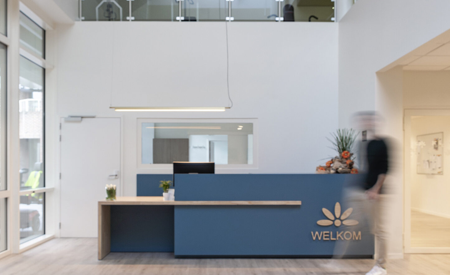
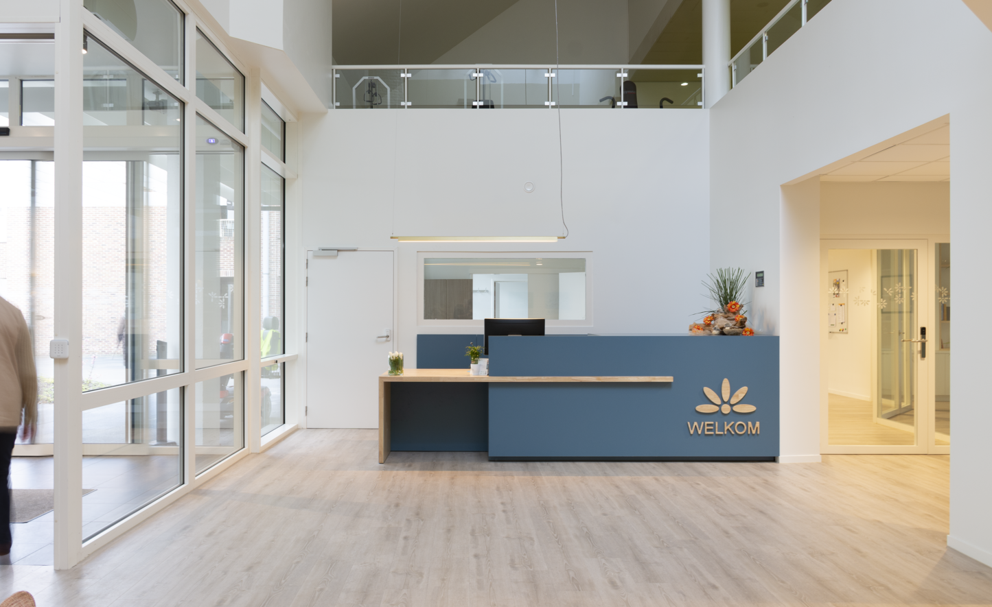
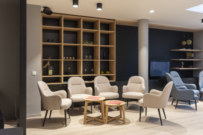
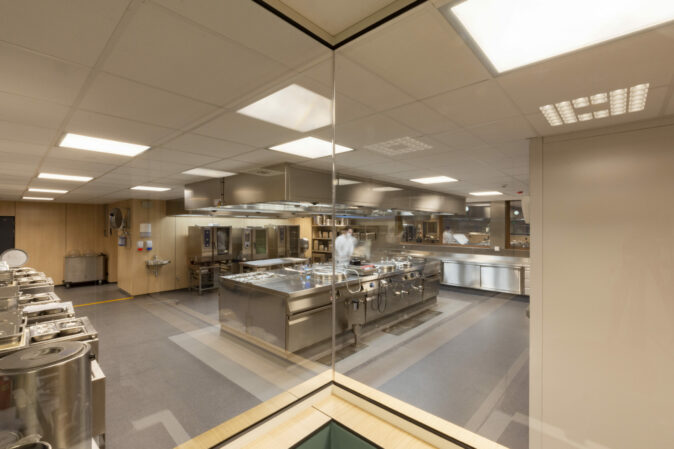
In addition to this new building, some of the existing buildings have also been renovated: the grand café and the reception area with its associated administrative rooms. The basic idea was to optimise the use of space and to bring the premises’ look and feel in line with both contemporary tastes and the other campuses run by the non-profit organisation Amate to create cohesion. The Amate house style has therefore been employed throughout the building. This meant a consistent choice in favour of a light timber structure, which runs throughout the building. In rooms for residents and/or staff, this light timber is combined with cheerful accent colouring, which is alternated to facilitate orientation within the building. The treatment of the entrance area was based on the same philosophy.
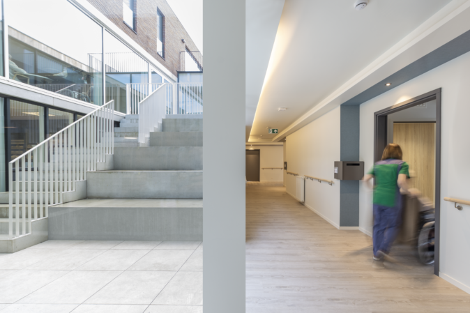
The entrance is clearly marked out by an open canopy on the outside of the building. The residential care centre is entered via a secure glass lobby which leads straight into the reception area and the grand café. The reception desk is very open; behind it is the more closed back office and the other administrative rooms. An internal central corridor has been created for staff, as well as a public corridor running behind it, which provides access to one of the wings of the campus.
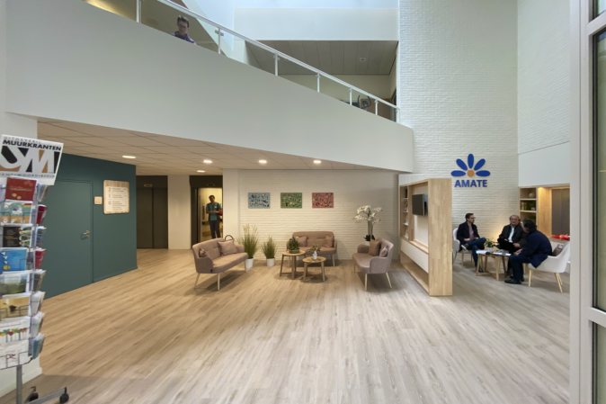
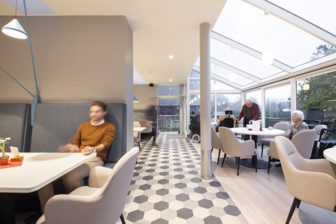
All the offices receive as much natural light as possible through a glass wall. In areas that are also designed with visitors in mind, the light Amate timber is combined with black and grey highlights. This gives these spaces a contemporary touch, making them attractive areas for both people from outside and local residents.
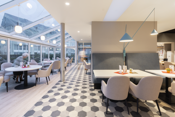
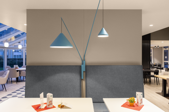
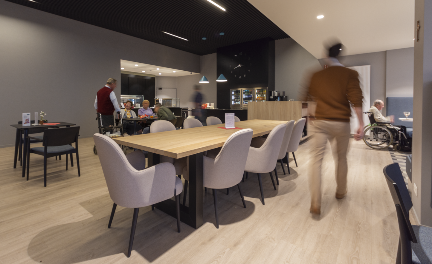
This was especially important for the grand café, as it is the heart of the Sint Jozef care campus. It is a busy place where not only residents but also people from the local area come together to eat, drink, listen to a performance, play board games and so on. This space has been opened to admit as much natural light as possible. The terrace was widened towards the main entrance for maximum enjoyment of the open air in the summer. Small, cosy sitting areas were created, with a combination of different seating options enabling everyone to find a favourite spot. Performances have been made possible by creating space to build a stage and an adapted sound system. In terms of materials, the light Amate timber structure and black highlights have been used. A felt ceiling has been used to ensure good acoustics. Petrol blue accents brighten up the room and are a subtle reference to the blue colour in the Amate logo.
want to know more about assar or contribute to its continuous development